Android Design Support Library made our day easier by providing backward compatibility to number of material design components all the way back to Android 2.1. In Design support Library the components like navigation drawer, floating action button, snackbar, tabs, floating labels and animation frameworks were introduced. In this article we are going to learn how to implement material tabs in your apps.
Before going further, I suggest have a look at this tabs docs that defines do’s and don’ts while implementing tabs.
1. Making the App Material
We’ll start this by creating a new project and applying the material theme. If you are not aware of android material design, my previous article Android Getting Started with Material Design gives you a good start.
1. In Android Studio, go to File ⇒ New Project and fill all the details required to create a new project. When it prompts to select a default activity, select Blank Activity and proceed.
2. Open build.gradle and add android design support library com.android.support:design:23.0.1
build.gradle
dependencies {
    compile fileTree(dir: 'libs', include: ['*.jar'])
    compile 'com.android.support:appcompat-v7:23.0.1'
    compile 'com.android.support:design:23.0.1'
}3. Open colors.xml located under res ⇒ values and add the below color values.
colors.xml
<?xml version="1.0" encoding="utf-8"?>
<resources>
    <color name="colorPrimary">#125688</color>
    <color name="colorPrimaryDark">#125688</color>
    <color name="textColorPrimary">#FFFFFF</color>
    <color name="windowBackground">#FFFFFF</color>
    <color name="navigationBarColor">#000000</color>
    <color name="colorAccent">#c8e8ff</color>
</resources>4. Add the below dimensions to dimens.xml located under res ⇒ values.
dimens.xml
<resources>
    <!-- Default screen margins, per the Android Design guidelines. -->
    <dimen name="activity_horizontal_margin">16dp</dimen>
    <dimen name="activity_vertical_margin">16dp</dimen>
    <dimen name="tab_max_width">264dp</dimen>
    <dimen name="tab_padding_bottom">16dp</dimen>
    <dimen name="tab_label">14sp</dimen>
    <dimen name="custom_tab_layout_height">72dp</dimen>
</resources>5. Open styles.xml located under res ⇒ values and add below styles. The styles defined in this styles.xml are common to all the android versions.
styles.xml
<resources>

    <style name="MyMaterialTheme" parent="MyMaterialTheme.Base">

    </style>

    <style name="MyMaterialTheme.Base" parent="Theme.AppCompat.Light.DarkActionBar">
        <item name="windowNoTitle">true</item>
        <item name="windowActionBar">false</item>
        <item name="colorPrimary">@color/colorPrimary</item>
        <item name="colorPrimaryDark">@color/colorPrimaryDark</item>
        <item name="colorAccent">@color/colorAccent</item>
    </style>

</resources>6. Now under res, create a folder named values-v21. Inside values-v21, create another styles.xml with the below styles. These styles are specific to Android 5.0
styles.xml
<resources>

    <style name="MyMaterialTheme" parent="MyMaterialTheme.Base">
        <item name="android:windowContentTransitions">true</item>
        <item name="android:windowAllowEnterTransitionOverlap">true</item>
        <item name="android:windowAllowReturnTransitionOverlap">true</item>
        <item name="android:windowSharedElementEnterTransition">@android:transition/move</item>
        <item name="android:windowSharedElementExitTransition">@android:transition/move</item>
    </style>

</resources>7. Finally open AndroidManifest.xml and modify the theme to our customized theme by changing the android:theme attribute value.
android:theme="@style/MyMaterialTheme"
AndroidManifest.xml
<?xml version="1.0" encoding="utf-8"?>
<manifest xmlns:android="http://schemas.android.com/apk/res/android"
package="info.androidhive.materialtabs" >
<application
android:allowBackup="true"
android:icon="@mipmap/ic_launcher"
android:label="@string/app_name"
android:theme="@style/MyMaterialTheme" >
<activity
android:name=".activity.MainActivity"
android:label="@string/app_name" >
<intent-filter>
<action android:name="android.intent.action.MAIN" />
<category android:name="android.intent.category.LAUNCHER" />
</intent-filter>
</activity>
</application>
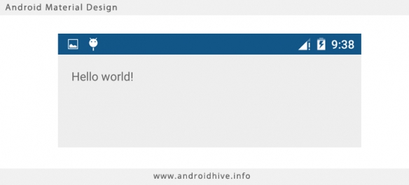
</manifest>Run the app and verify the material theme by observing the notification bar color. If you see the notification bar color changed, it means that the material design theme is applied successfully.
Now we have our app material ready. So let’s start adding the tabs. But before that we’ll create few fragment activities for testing purpose. All these fragment activities contains very simple UI with only one TextView.
8. Under your main package create a fragment named OneFragment.java and add the below code.
OneFragment.java
package info.androidhive.materialtabs.fragments;

import android.os.Bundle;
import android.support.v4.app.Fragment;
import android.view.LayoutInflater;
import android.view.View;
import android.view.ViewGroup;

import info.androidhive.materialtabs.R;


public class OneFragment extends Fragment{

    public OneFragment() {
        // Required empty public constructor
    }

    @Override
    public void onCreate(Bundle savedInstanceState) {
        super.onCreate(savedInstanceState);
    }

    @Override
    public View onCreateView(LayoutInflater inflater, ViewGroup container,
                             Bundle savedInstanceState) {
        // Inflate the layout for this fragment
        return inflater.inflate(R.layout.fragment_one, container, false);
    }

}9. Open fragment_one.xml located under res ⇒ layout and do the below changes.
fragment_one.xml
<RelativeLayout xmlns:android="http://schemas.android.com/apk/res/android"
    xmlns:tools="http://schemas.android.com/tools"
    android:layout_width="match_parent"
    android:layout_height="match_parent"
    tools:context="info.androidhive.materialtabs.fragments.OneFragment">

    <TextView
        android:layout_width="wrap_content"
        android:layout_height="wrap_content"
        android:text="@string/one"
        android:textSize="40dp"
        android:text
        android:layout_centerInParent="true"/>

</RelativeLayout>10. Likewise create few more fragment activities with same code we used for OneFragment.java. I have created TwoFragment.java, ThreeFragment.java, FourFragemnt.java ….. upto TenFragment.java


Be the first one to write a response :(
{{ reply.member.name }} - {{ reply.created_at_human_readable }}